The role of digital marketing has proven itself effective during the pandemic. Companies that have invested in their online presence have survived the initial crunch of the crisis.
With social distancing, a boom in e-commerce was observed. This meant that businesses that had an online presence have been able to improve their sales online.
Google released an update for its core algorithm last May and it had an impact.
The Google May Core Update affected websites shifting ranks due to the improvements in the algorithm. Google said that changes observed were due to an improvement in the understanding of relevance and users’ intentions.
What does this mean for me?
What this means for businesses now is that a proper online presence has become somewhat of a necessity.
The good thing about this is that the benefits are long-term. The pandemic will not last forever but the impact of digital marketing just might. Done right, a proper strategy will ensure your site is always visible online.
It takes some work to improve your online presence. A well-built site is a good place to start. Why? Because this is where you want your audience to end up.
Like any physical store, you’ll want to make sure your guests are happy while they’re there. This means investing time, and money, on your website.
It’s a long process but a fruitful one. To get you started, we’ve compiled 5 tips that should help you out.
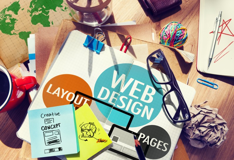
5 Tips for Web Design
1. Prioritize user experience
You can compare user experience to any store experience you have. It’s essentially how users experience your website and how they react to it.
You want to make these users comfortable and give them an easy time. For websites, this means keeping an eye on a couple of things.
Take navigation for example. Do users have a hard time going through your site? There are a couple of ways you can make sure they navigate with ease:
- Have a sitemap handy
- Utilize breadcrumb trails
- Make sure your pages are readable
- Have a clear and clean layout
Another thing to think about is your mobile site. With many people dependent on their smartphones for product searches, you’ll want to make sure that you can cater to their needs.
Enter, responsive web design. Having a responsive page means that your site can automatically adjust to the users’ screen sizes. This means that no matter what device, you can send the right message.
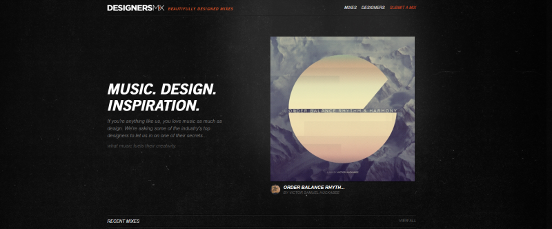
2. Small animations, big impact
We don’t mean a full-on cartoon or anything like that. Adding animated elements to your site will greatly improve immersion.
These elements can be anything; from panels with text that shifts into the background to a dotted line that follows the user’s scrolling. It’s about being creative with the space you have.
Take the website of Genoa Healthcare as an example. On their homepage, the site has a section labeled “By the Numbers”.
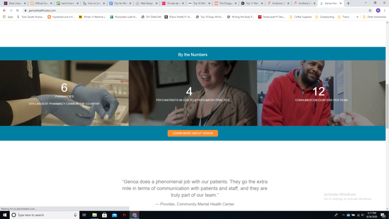
Instead of having the numbers as plain text, the website triggers a counting animation once the user scrolls down to the panel.
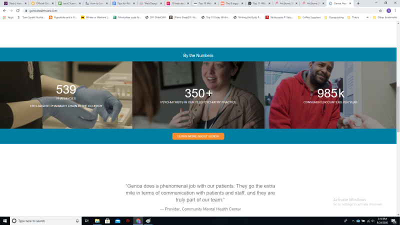
It’s a simple animation and yet it brightens the page up considerably. Using this in conjunction with other web design strategies can certainly help with site interaction. It’s like making boring data fun.
Finding a place for these animations can take some time. The advantage Genoa Healthcare had here was that they invested in a professional web design firm.
The investment turned out to be a good one as they claimed an 80% increase in sales leads.
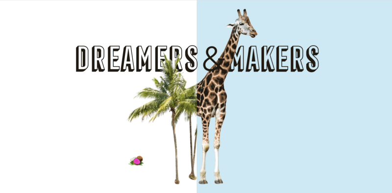
3. Get creative with colors and space
But of course, aesthetics has a role to play here. Web design will depend on the site owners and what kind of brand they’re trying to prove themselves to be.
Having the right design elements will help you with that message. You can try checking out the trending designs. Take notes of elements you find and figure out how you can integrate these into your site.
A few design points you can start with:
- Integrate a Dark Mode
- Make the most out of Layers
- Creative use of space
Take the above image as an example. It uses a dark theme by default while at the same time making the most out of the empty spaces around the focus. You can see how this can direct the user’s attention while also being aesthetically pleasing.
It all comes down to how you want people to remember your site. Are you strictly professional? Or do you want to show your approachable side?
This will be a determining factor in your overall Web design.
4. Typography rules and when to break them
Typography in the context of web design has largely focused on ensuring readability across multiple devices.
While that remains a significant point, people have been finding creative ways to break the rules.
Text visibility isn’t the primary concern here, the overall design is
An example of this trend that you may have noticed is the oversized text header. These serve both as visually attractive dividers and section labels. As with the site above, the divisions are seen with each new panel.
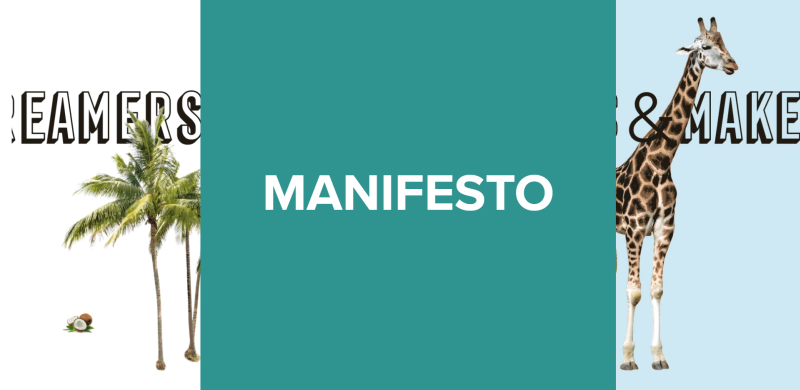
The front panel expands to present the new section
Each division is introduced with a large panel depicting the section’s title. This makes a highly immersive and captivating home page.
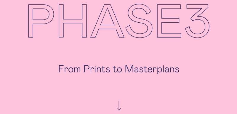
The welcoming page is purely text over a color-changing background
One big trend to watch out for is the typography centered “above-the-fold”. Instead of relying on images or videos, a well-designed typography welcome screen can lower loading times while enticing the user.
5. Mix your media
Another aesthetics-focused tip, and this one focuses on your use of photographs with digital art. It’s a trend that’s been on the rise and it just might help you with your user experience.
Imagine it like this: You can add digital sketch-ups on a photo of a model, labeling each piece so that the customer knows exactly what you mean.
Alternatively, you can use it just to prove a point. Take this edited Mona Lisa as an example:

Simple things like this can help you entertain and interest your users.
It’s like those diagrams you see in children’s books. It’s a handy way of pointing things out but with a very aesthetics-focused mindset.
Conclusion
The bottom line here is: serve the customer. Web design isn’t necessarily about what you want. Pay attention to what your audience responds to.
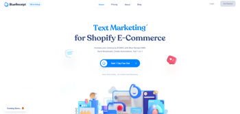
Often it’s a combination of strategies that makes an effective web design. Take the above photo as an example.
It’s too bad you can’t see the animation from a screenshot. The bright blue text changes, changing the phrase with each cycle. The 3D elements also bounce in place, adding to the friendly vibe.
Add to that the liberal use of space. It’s easy to take in despite all the 3D elements in the foreground.
With Google, user experience counts a lot for ranking. If customers click your link and hit “back” right afterward, that’ll reflect badly on your rank. Keep in mind, it will help to track your site’s data.
Your web design is crucial to your users’ experience. Invest time and money and you can expect long-lasting benefits.
Leave a Reply